We Have a New Look!
The Homeless Prenatal Program is thrilled to debut its new logo and brand identity. After 34 years of providing services to families in San Francisco, the agency has adopted a look that complements our mission and organizational culture.
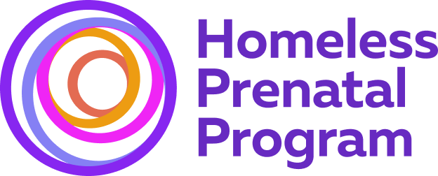
Our new logo is a series of concentric circles that overlay and interact. This mark appears abstract but is imbued with important meaning — ideas of community and completion. The symbol draws inspiration from the visual model of Circles of Care, where individuals and their healing are influenced and cared for by a holistic system of communities. It also reflects the idea that actions ripple outward and can create broader change and influence. The circles create dynamism, suggesting movement and interaction, much like spending a day at HPP. Concentric circles also represent the family enclosure, encircling of loved ones, and community coming together.
Our brand colors are vibrant, bold, and welcoming. The hand-drawn elements add a human touch that mirrors the approach to our service delivery. We hope this identity is inviting to all and emphasizes the joy and vibrancy that not only our staff and clients bring but is also felt in the transformational nature of our work to break the cycle of family poverty and homelessness.
